- Formation Graphic Design
- Promotion 2017
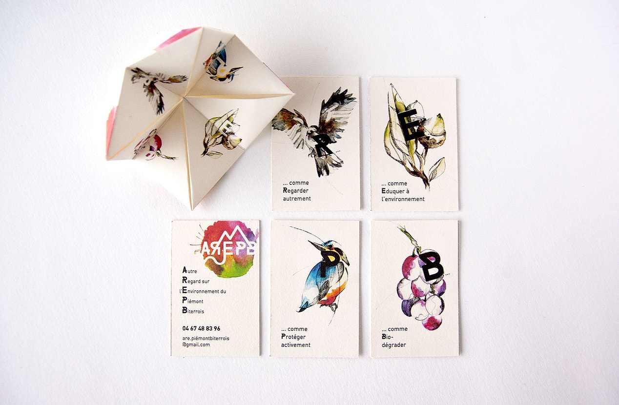
During her 2nd year of BTS Graphic Design, Priscille Derekenei had the project to work on the visual identity of the environmental association AREpb. Discover these works ...
This project concerns the renewal of visual identity for an environmental education association, linked to a territory: the Piedmont Béziers. The proposals of supports are to think of the least cost for a real utility.
The first proposal focuses on the territory of intervention, by the location of the plain Biterroise between the Mediterranean Sea and the Black Mountain, in the logo. The watercolor task in the background, evokes the diversity of the environment as well as its fragility and its raw and unpredictable appearance.
The second proposal seeks to illustrate the diversity of the fauna and flora of this environment by an interweaving of the emblematic silhouettes of the territory: the martin-sinner to the cicada through the vine leaf. The open circle they form, evokes the union to act as well as the will to inform, educate and prevent. This diverse range of fauna and flora is inspired by the work of Grapus for the logo common to the National Parks of France.
Discover his wesite : priscillederekenei.wix.com
-
student project Multimedia Graphic DesignPromotion 2017
Cœur de Ville en Lumières : the video

-
student project Multimedia Graphic DesignPromotion 2017
Graphic design project in partnership with "Bambouseraie d'Anduze"

-
student project Multimedia Graphic DesignPromotion 2017
Sociostyle workshop

-
student project Multimedia Graphic DesignPromotion 2017
Visual identity search for the concert hall "The Rockstore"
-
student project Multimedia Graphic DesignPromotion 2017
Clique-Claque
